When it comes to grabbing attention online, visuals and video are your secret weapons. People are scrolling through feeds at warp speed, so if your visuals don’t stand out, they’re just background noise. But don’t worry! With a few strategies and the right tools, you can make visuals that turn heads, stop thumbs, and hold attention longer than 5 seconds.
Let’s dive into some strategies for creating visuals that not only look good but pull people in and keep them interested.
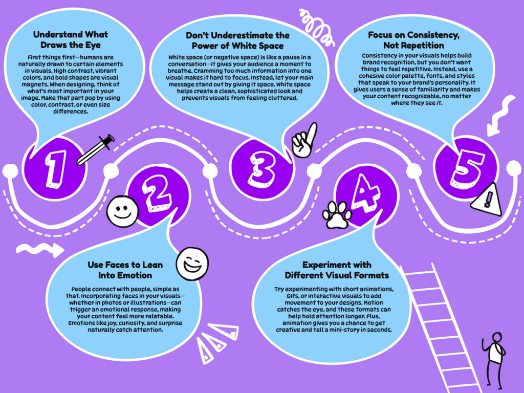
1. Understand What Draws the Eye
First things first – humans are naturally drawn to certain elements in visuals. High contrast, vibrant colors, and bold shapes are visual magnets. When designing, think of what’s most important in your image. Make that part pop by using color, contrast, or even size differences.
If you’re unsure how to balance all these elements, SketchWow’s AI tools can lend a hand by suggesting standout colors and layouts that can help boost attention. Our AI tools focus on helping you create visuals that are eye-catching but don’t overwhelm the viewer. Think of it like designing with a little pro guidance in your corner.
2. Use Faces to Lean Into Emotion
People connect with people, simple as that. Incorporating faces in your visuals—whether in photos or illustrations—can trigger an emotional response, making your content feel more relatable. Emotions like joy, curiosity, and surprise naturally catch attention.
Even when you’re working with graphs or diagrams, try adding human elements or icons that add some personality. A few small details can make your visuals feel more engaging and pull users in.
3. Don’t Underestimate the Power of White Space
White space (or negative space) is like a pause in a conversation, it gives your audience a moment to breathe. Cramming too much information into one visual makes it hard to focus. Instead, let your main message stand out by giving it space. White space helps create a clean, sophisticated look and prevents visuals from feeling cluttered.
SketchWow’s AI also helps here, suggesting layouts that give your visuals breathing room. So whether you’re creating a flyer or designing an infographic, using white space well can make all the difference.
4. Experiment with Different Visual Formats
Static images are great, but there are plenty of other ways to get your message across. Try experimenting with short animations, GIFs, or interactive visuals to add movement to your designs. Motion catches the eye, and these formats can help hold attention longer. Plus, animation gives you a chance to get creative and tell a mini-story in seconds.
5. Focus on Consistency – Not Repetition
Consistency in your visuals helps build brand recognition, but you don’t want things to feel repetitive. Instead, use a cohesive color palette, fonts, and styles that speak to your brand’s personality. It gives users a sense of familiarity and makes your content recognizable, no matter where they see it.

Make Your Visuals Work for You
When you start applying these techniques, you’ll notice your visuals doing a lot more heavy lifting—catching attention, engaging users, and ultimately keeping them around longer. And if you’re ready to take your visuals to the next level, SketchWow is here to help. With a few clicks, you’ll be designing eye-catching content that looks professional and pulls people in.
So go ahead, start experimenting, have some fun with it, and see how eye-catching visuals can give your content the attention it deserves. Happy designing!


