Alright, design enthusiasts, let’s get real! Whether you’re a budding artist or just someone who wants to make your projects look a little less “meh,” understanding the basics of design is where you start. Design isn’t just about making things pretty—it’s about effective communication. So, let’s break down the essentials of design in a way that’s as fun as it is informative!
1. The Elements of Design: Your Building Blocks
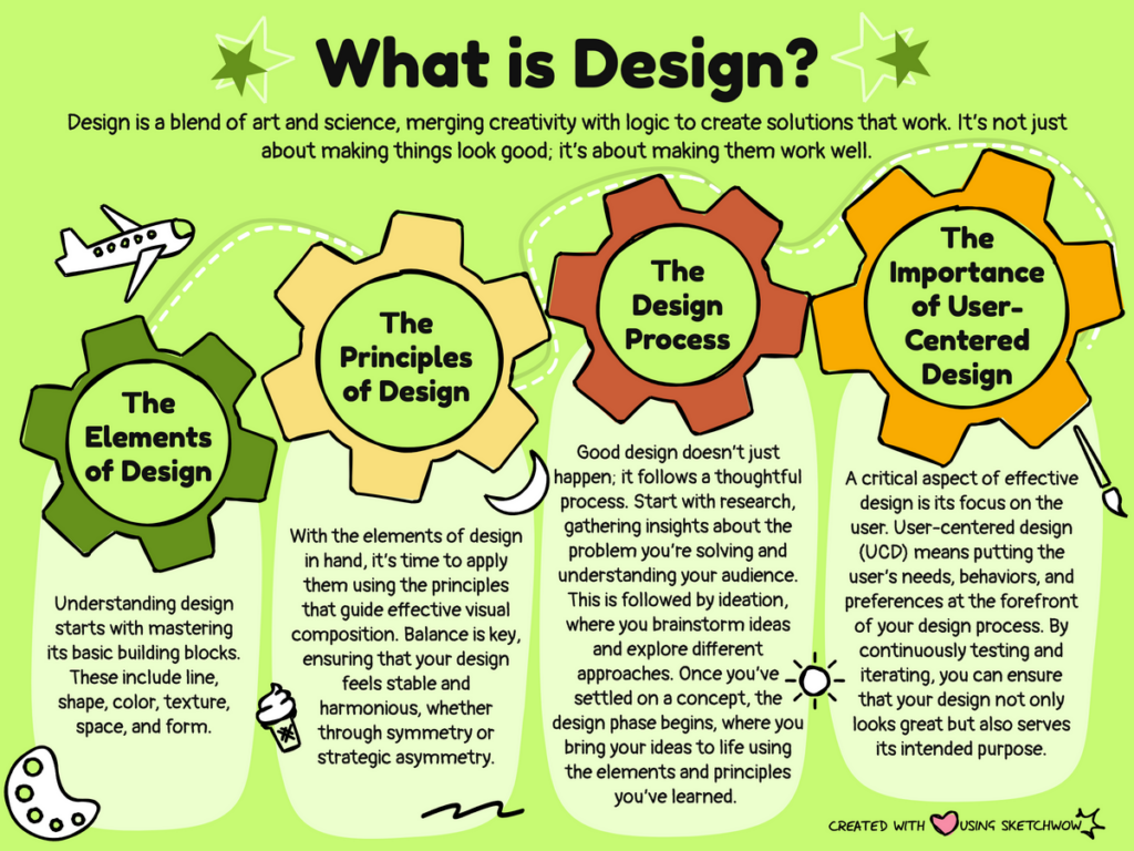
First things first—let’s talk about the building blocks of design. These elements are like the ingredients in your favorite recipe. If you don’t have the right ones, your dish (or design) isn’t going to turn out great.
- Line: The simplest element, but oh-so-powerful! Lines can be straight, curved, thick, or thin, and they guide the viewer’s eye and create movement.
- Shape: This is where things get interesting! Shapes can be geometric (think squares and circles) or organic (like clouds or blobs). They help to create structure and visual interest.
- Color: Color isn’t just pretty; it evokes emotions! Warm colors like red and orange can energize, while cool colors like blue and green can calm. Choose wisely to set the mood!
- Texture: This refers to the surface quality of a design—how it looks and feels. You can add texture through patterns or actual textures in photos, giving your designs depth.
- Space: Also known as white space, this is the area around elements. Don’t underestimate it! Space helps to separate items and makes your design easier to digest.
2. Principles of Design: The Rules of the Game
Once you’ve got your elements down, it’s time to play by the rules. The principles of design guide how those elements come together to create effective visuals.
- Balance: This is all about distribution. You want your design to feel balanced, whether it’s symmetrical (even on both sides) or asymmetrical (different but still harmonious).
- Contrast: This principle helps elements stand out. Use contrasting colors, sizes, or shapes to draw attention to important parts of your design.
- Alignment: Keep things organized! Proper alignment creates a clean, professional look and helps guide the viewer’s eye through your design.
- Repetition: This is where you create consistency. Use the same colors, fonts, and styles throughout your design to tie everything together.
- Proximity: Group related items together. This helps to create a visual relationship between elements and makes information easier to process.
3. The Importance of Typography
Let’s not forget about typography—what you say is just as important as how you say it! The right fonts can enhance your message and set the tone. Here are some quick tips:
- Choose Fonts Wisely: Pair a fun display font with a clean sans-serif for easy reading. Avoid using too many different fonts—stick to two or three for a cohesive look.
- Hierarchy Matters: Use size and weight to create a hierarchy. Make your headlines larger and bolder to grab attention, while body text should be smaller and easy to read.
- Line Spacing: Don’t cram everything together! Proper line spacing (or leading) can make a huge difference in readability. Give your text room to breathe.
4. Design for Your Audience
Understanding your audience is key to effective design. You wouldn’t design a kid’s birthday invitation the same way you’d design a corporate report, right? Consider who you’re designing for and tailor your approach accordingly.
- Think About Demographics: Age, gender, interests, and cultural backgrounds can all influence how people perceive design.
- User Experience (UX): Design isn’t just about looks; it’s about usability too. Ensure that your design is intuitive and easy to navigate.
5. Practice, Practice, Practice!
The best way to understand design is to dive in and start creating! Don’t be afraid to make mistakes; every misstep is a lesson learned.
- Experiment: Try different styles, colors, and layouts. Play around with your designs until you find what works.
- Seek Feedback: Share your work with friends, family, or online communities. Constructive criticism can help you see things from a fresh perspective.
- Study the Greats: Look at designs that inspire you. Analyze what works and why, and then apply those lessons to your own work.

The Bottom Line: Design Is for Everyone
Design isn’t reserved for the pros; it’s for anyone who wants to communicate better visually. By understanding the basics—elements, principles, typography, and audience—you can create designs that are not only beautiful but also effective.
So grab your tools, get creative, and remember: every great designer started somewhere. Happy designing!


