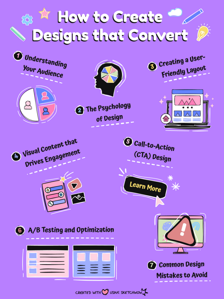
You’ve got the eye for design, and you’ve got the tools, but let’s be real — just looking good isn’t enough. Whether it’s a landing page, an ad, or a marketing email, if your design isn’t converting, what’s the point? Good design doesn’t just catch the eye; it makes people act. Let’s dive into how to make designs that turn clicks into conversions and browsers into buyers!
1. Start with the Goal in Mind
Okay, first things first. Before you even think about colors or fonts, ask yourself: What’s the goal? Do you want someone to sign up for your newsletter? Buy a product? Book a demo? If your design doesn’t have a clear, focused goal, people won’t know what to do. Keep that goal front and center!
- Pro Tip: A confused mind never buys. Make it super obvious what action you want people to take, and design everything around that action.
2. Keep It Simple, Silly (K.I.S.S.)
Let’s get one thing straight: clutter kills conversions. Sure, you’ve got a bunch of cool elements and fancy features, but cramming them all into one design? Nope. You’ve got to K.I.S.S. (Keep It Simple, Silly!). The cleaner your design, the easier it is for people to focus on what matters. White space is your best friend here.
- Pro Tip: Less is more. If it doesn’t directly contribute to your goal, ditch it.
3. Eye-Catching, Not Eye-Searing
Bright neon colors and funky fonts might get attention, but if your design hurts people’s eyes or makes text hard to read, they’re out of there. Choose colors that fit your brand but also create contrast where it matters—like for buttons or calls to action (CTAs).
- Best Practice: Use colors to highlight key areas like CTAs or headlines.
- Avoid: Font overload. Two to three fonts max, or you’ll have a design that looks more like a ransom note than a sales page.
4. CTA = VIP
Speaking of CTAs, this is the moment of truth. Your Call-to-Action is what drives conversions, so it better be loud, clear, and impossible to miss. Use actionable language like “Get Started” or “Join Now,” and make sure that button looks like it wants to be clicked.
- Pro Tip: Make your CTA buttons stand out with contrasting colors and plenty of space around them so they don’t get lost in the noise.
- Avoid: Vague CTAs like “Submit” or “Click Here”—people want to know exactly what’s going to happen when they click that button.
5. The Power of Imagery
We’ve all heard the saying: “A picture is worth a thousand words.” But let’s tweak that to: “A picture is worth a thousand clicks.” Create images that resonate with your audience and reflect your message. People connect emotionally with visuals, so use images that tell a story and align with your brand.
- Pro Tip: High-quality images > Stock photos that everyone’s seen a million times. If you can, go for unique visuals that feel authentic.
6. Trust Signals Are Key
Want people to trust you? Show them that others do. This is where things like testimonials, reviews, and trust badges come into play. People are more likely to convert if they know they’re in good hands.
- Add these to your design:
- Customer testimonials (with real faces, if possible).
- Logos of companies you’ve worked with.
- Trust badges like “Secure Checkout” or “Money-Back Guarantee.”
7. Mobile First, Always
Here’s a fact: More people are browsing on their phones than ever before. So if your design looks amazing on a desktop but turns into a jumbled mess on mobile, you’ve lost half your audience. Make sure your design is responsive and mobile-friendly from the start.
- Pro Tip: Test your design on different devices to make sure everything looks just as good on a phone screen as it does on a laptop.
8. Speed = Conversions
People are impatient, and they’re not going to wait around for a slow-loading design. In fact, every second of loading time can cost you conversions. Keep your file sizes light, optimize your images, and don’t overload the design with elements that slow things down.
- Quick Fixes: Compress images, minimize animations, and reduce the number of scripts running on your page.
9. Use FOMO (Fear of Missing Out)
People hate missing out on good deals, and you can use that to your advantage. Create a sense of urgency with time-sensitive offers or limited availability. Words like “Only a few left!” or “Offer ends tonight!” can give that extra nudge someone needs to click.
- Pro Tip: Timers and countdowns are perfect for adding urgency without feeling too pushy.
10. Test, Tweak, Repeat
Finally, never stop improving. Once your design is out there, you need to see how it performs. Try A/B testing different versions to see which one gets more clicks or conversions. Sometimes a simple tweak—like changing the color of a CTA button—can make a big difference.
- Pro Tip: Keep an eye on your analytics and experiment with small changes to see what works best.

The Bottom Line: Design with Purpose
Design that converts is all about clarity, simplicity, and action. Keep your goal in mind, cut the clutter, and guide people’s attention to exactly where you want them to go. Whether it’s with a killer CTA, clean design, or a bit of FOMO, always remember: good design doesn’t just look nice—it gets results.
Happy designing, and here’s to your next conversion!


